How Participants of the Visualisingdata Census are Connected on Twitter
3 weeks ago Andy Kirk started a survey for the data visualization community. More than 1500 people participated within one week. The results can be viewed in this Google spreadsheet. The survey contained 7 short questions, one of which asked for the participant's Twitter handle.
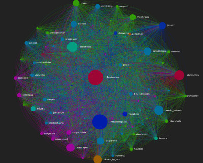
I took these Twitter handles, removed duplicates, and queried the Twitter API for each participant's friends (people they follow on Twitter) to construct the visualisingdata census network graph. The graph only includes survey participants and consists of 1189 nodes and 11833 edges. The average degree in this network is 9.952 and the average path length 3.074. There are 182 weakly and 597 strongly connected components, and 191 communities detected using the Louvain method.
The node sizes are based on in-degree, so the Twitter user with the most followers is the largest node in the network. It shouldn't be a surprise that Andy himself has the highest in-degree (524), since he initiated this survey and called for participants on Twitter several times during the time it was open. Nathan Yau comes pretty close (515) than there is gap between him and the following well-known people in the data visualization community: Andrew Vande Moere (347), Alberto Cairo (340), Moritz Stefaner (309), Gregor Aisch (293), Robert Kosara (274), Jan Willem Tulp (253), Scott Murray (238), Jérôme Cukier (234).
Limitations
Collecting the data from Twitter took a few days mostly due to Twitter API rate limits and ended on 8 April 2013. During this time and afterwards, user connections may have been added or removed or Twitter accounts may have been closed. Not all Twitter names that appear in the survey results could be queried, some names were not valid or resulted in API error responses.
Moreover, some accounts are protected from retrieving friends data. While the latter are included in the graph they have no outgoing edges, although the may actually follow other users in the network.
Credits
First of all thanks to Andy for initiating this survey and making the results available and to all people who participated.
The initial graph file was created with a Python script using the networkx library, the resulting gexf file was preprocessed with the Gephi visualization platform including calculations of network measures, coloring and applying a Force Atlas 2 layout. The interactive version is rendered with the JavaScript library sigma.js.
Published on April 09, 2013 (updated on November 18, 2020) by Ramiro Gómez (@yaph). To be informed of new posts, subscribe to the RSS feed.
Tags: network graph, twitter, sigmajs, gephi, networkx.